Wednesday, 20 January 2010

Objects

these are some of my object final images
This is the leaf i chose to print it is the most effective of all the ones i tool i brightened it up a little in photoshop
This is the sunset image i again brightened it up in photoshop to make it a little brighter and more dramatic looking.
The next is my commercial image i chose to do it only half lit and in black and white as i feel it is fitting to the brand and looks much better than in colour

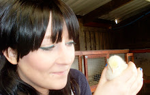
This is an image of an egg i didnt chose this as a final image as the lighting was to yellow and i didnt like the effect it gave
This is the image i chose for matural forms i quite like this image but dont feel it is as strong as the others.

Objects-Macro

The following images are examples of macro photography for my images i have chosen to do a leaf and also glitter for my second image,i chose both of these subjects as they are very small and detailed i esspecially like the leaf the very tiny deatail of the leaf i really like i also like the glitter images but the leaf is my favorite.
the top image was the final image which i printed i like the detail found with the macro lense it was so small i couldnt see it with my eye.


These following images are of the glitter i did pink and black and a mixture of the two i think the pink image is the best and is the one i chose to print as my final image.


Tuesday, 19 January 2010

Objects

For the objects breif we wernt told what to photograph just the different ways in which to do it, close up/macro, natural formes, comersial and reflective surpheses,
These are my images . . . . .
The following are my reflective surfaces i chose to do knifes and coins there pretty obvious as far as reflective objects go however i took the images using a macro lense and quite like the effects. The knife the top being my final image i like this image the best because it shows all the scratches in really fine detail,i like how the light reflects onto the side of the knife to show that there is two knfes rather than the original one. I tried quite a fre different arrangements of the knifes but feel the first works the best.


I chose to do the pennys as a macro image as well and tried to make all the raised areas the lit parts of the image i feel i have acheived this on the first image i tried a few different arrangements as with the knifes but feel the first is best i chose this as one of my final prints for part of the objectss breif.


Reflection

Reflection
I was under the impression that a rainbow was a reflection however i have got mixed responses some say it is reflection of the rain off the sun and some say it is refraction, well anyway this was my image i have brightened the colours in photo shop to make the rainbow more intense also put a filter on to add grain to add more texture to the image.


Camera Lense Techniques

These images are the drop focus, focal length and dof, the first is the drop focus,
i think this is probably my favorite image so far i like the colour in it and the way the pencils meet in the middle and fade from one side to the other, i wasn't really sure what drop focus was as i had missed the lecture on it but thanks to sara i was told how to do it and found it quite easy i like doing close up shots and macro photography i think you can make most things look interesting if you get close enough.

This is the focal length image i am not very happy with them i just don't really like the full guitar i think its quite boring and plain threes not really much going on the closer one is better but i am still not completely sold on it.

The final image is the dof image, i tried to think of something exciting to do but i settled for a selection of nail varnishes i find them quite exciting however not sure if anyone else will,i chose these as they were bright and i like the blue and pink together i think it work's well i did a few colours before i decided on these ones i have a slight nail varnish obsession so had a few to chose from but i think the colours work well and i ave achieved the dof.

Camera Lense Techniques-Motion Blur

For this brief we had to show different lense techniques shallow depth of field, drop focus, focal length and motion blur, I'm happy with some of my images a lot more than others i will explain as i go . . . . . . here are my images . . . . .

This is motion blur i thought it would be good to try something a bit harder and new for this as i have done traffic trails a few times before which is the obvious motion blur choice so tried to do something i haven't tried before, i think the first image is the best and that's why it is at the top i like how it shows movement but you can still see the fingers i tried a few times and only managed to get a pink blur where the hands should be but i think this works better where you can still make out the outline of the fingers i left some others in i wasn't completely happy with to show the different speeds.


I tried to use a long shutter speed with this tree i saw it blowing all over in the wind and thought it would make a god image but instantly didn't like the result i still put it on here to show my mistakes its good to learn from.
I also tried some motion blur images in my sink at home i wanted to create a sort of whirlpool effect i tried it both with just water and with soap and water as well so you could see the water better with a bit of colour in it however i wasn't able to get the effect i wanted so i tried something else and preferred the guitar images.


Lighting Fruit

Fruit - We had to light the fruit using high key, low key, 45 45 , back and top lit.
Here are my images . . . . .


This image was taken using 45 45 lighting with two softboxes at either side at 45 degrees each, i don't like the effect it has i think its a little dull.


This is my high key image i quite like how the little seeds inside the fruit are all reflecting the light but still this isn't my favorite of the set.
This is my low key image and my favorite of the set i think the black background works much better that the wight and it has a good contrast with the middle being so bright white and the outside being so dark.

This is my back and top lit image as i have said for the previous images i don't think this fruit works well on the White background.

Lighting Glass part 2

This is the glass bottle we were told to light using a beauty dish, umberalla, softbox and honeycomb. Sara had braught in some bottles with oil in and leaves which were a lot more interesting than mine so i stole one off her to use THANKS SARA!
Here are my images . . .

this image was taken using a softbox i quite like thisimage and the highlight on the side of the bottle.
This image was lit with a honeycomb the shadows are a bit harsh but i like how the leaves have been lit inside the bottle.
This one was lit using the umberella its to bright to be honest i like the bottom half of the image but not so keep on the top as its far to bright and looks really yellow.
The final image lit by the beautydish i like how theinside of the bottle is lit but i dont like how the glass has the reflection in the left hand corner,maybe i could have got rid of this using flagging,maybe nextime i will try this and see if it reduces the reflection.

Lighting - Glass

We were shown how to light glass in this studio lesson which is harder than i thaught it would be to be honest.
The first was lit using a soft box over the top of the bottle, i dont like this image as you can see the reflection of the softbox behind the bottle on the background.
This one was taken using a light above and below both with softboxes i think i=this image is better but i dont really like the shine on the bottle.
Thi image was taken the same way with a light both above and below but this time we used a technique called flagging i wasn't very good at it as you can still see the reflection in the lid which flagging is supost to stop.This image was taken with a light below to create the glow i think this works quite well.This image was obviously taken using natural light on a window ledge with the light coming through the window behind and works better than i thaught it would.

Here are some we did our selfs
Again using natural light from the window i dont think this type of bottle works as well with this light.This was taken in the lighting tent again using natural light from the window the image is to dark but it was an idea we wanted to test out.

This image was taken using light from the computers in the classroom i don't like this image at all or the wires in the background.


Light sources

We had a studio lesson and were told to go and find different light sources in and around the university and light a model using these, these are our findings.


This image was taken using the lights in the coridor they are above the model and i think it gives a nice shine on the models hair however is not a paticalarly flattering light source.

This image was taken using the red light in the darkroom it is quite dark but i think it gives a good effect.
This image was taken using the fluresent lights in the lift the light is also reflecter all around the model as the lift is metal and also has mirrors in it. I think this image is wuite cold although i do wuite like it.
This image was taken in front of the windows with the daylight coming streight in onto the models face and with me stood in front of her this image makes the model look pale and washed out.
This image was taken using a spotlight over the top ov the models head.
This image was taken using the light from the computer screens in the classroom, we put two together and faced them towards the models face i quite like this image but it isnt very well lit.

This image was taken using a flouresent light over the door i dont really like this image it gives quite harsh shaodws and is unflattering to the model again . . . sorry sara!